Improving the Pull Request (PR) Coverage Report
The PR coverage report is a simple readout for developers to understand if their code is thoroughly tested prior to merging to production. But it’s not perfect. Our product and design teams are staying on top of the feedback coming in on GitHub too.
With your feedback in mind, we started by reimagining the layout of the information with the following goals:
- Organize the data by priority
- Summarize key data points for at-a-glance understanding
- Shorten the information display
Here is a version with some of the initial iterations:

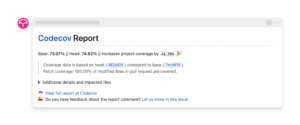
This layout includes a summary in the first line (with an emoji to help with quick scanning), a shorter default layout with the ability to expand/collapse additional details and copy changes to align with the app and improve clarity.
While the feedback on this new layout was generally positive, there was a design mistake: the patch was still visually secondary. The patch is a critical piece of information for developers because it shows the changes they made directly in the PR. Therefore, we realized that we needed to bring this information front and center to improve the summary view:

Here is the expanded view to show more details:
Making it Easier to Filter by Flag
Sifting through Codecov for the coverage tied to your flags can be time-consuming. That’s why we’ve added a new feature to help you navigate more efficiently.
Easily filter your files by flags in the Codecov UI. No more manual searching through files; focus directly on the flags that matter to you. This update aims to simplify your experience and save you time.
Give it a try and let us know how it enhances your workflow on Codecov. Have any thoughts on the changes to the changes to the PR comment? Let us know what you think here. And if you’re new to Codecov you can try it for free today or request a demo to get started.
